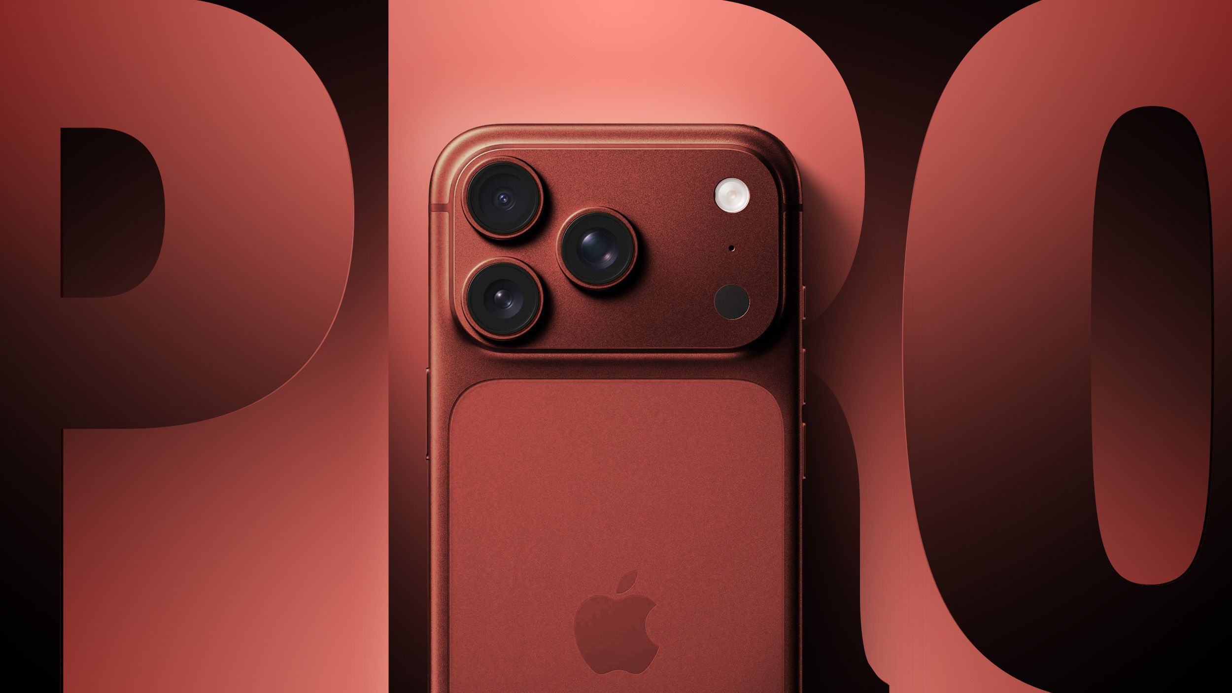
With iPhone users making up a large portion of mobile traffic, optimising your site for Apple devices should be a top priority. Constructing visually appealing websites tailored to iPhones provides users with a better experience and can boost conversions. This guide will explore techniques for creating stunning iPhone-friendly websites through clever use of colour, typography, imagery and responsive design. Read on to learn essential tips that will make your brand shine on even the smallest screens.

Use Complementary Purple Hex Codes
One of the best tips we can give you when building a visually appealing website is to think about using a purple hex code in your design. A purple hex code is a 6-digit hexadecimal code that represents a specific shade of the colour purple used for web design.
When piecing together a colour palette, shades of purple can add a touch of elegance. Combining different purple hex codes creates depth and visual interest. But with so many purple options, how do you choose complementary hues?
To find harmonising purple hues, it's a good idea to utilise an online colour wheel. Adjacent colours blend seamlessly together. For example, pair a soft lilac #E6E6FA with a brighter purple like #8A2BE2. Using multiple complementary purple hex codes adds style and flair.
Craft Responsive Layouts
Today's web users expect sites to work flawlessly on any device. Transforming your desktop layout into a mobile-friendly format requires strategic planning. For iPhones, focus on streamlining page elements into a single column.
Aim to reduce clutter by including only the most important content. Use minimal, multipurpose imagery that won't slow page loading speeds. Ensure text and buttons are sized for fingertips by increasing font sizes and spacing.
With iPhones ranging from compact SE models to giant iPhone 12 Pros, responsive frameworks are essential. Fluid grids and CSS media queries allow websites to adapt on the fly. Test pages regularly on various iPhone models to perfect the flexible layout.
Choose Legible Typography
Typography makes a substantial impact on interface aesthetics and usability. When selecting fonts for iPhones, lean towards clean, simple styles for optimal legibility. Avoid extremely thin or ornate typefaces, as these are harder to read at small sizes.
System fonts like San Francisco, Arial and Helvetica are safe bets that render well across iOS devices. Pairing one of these with a complementary web font can create more visual interest. Just ensure the web font has an upright, easy-to-read style.
Use larger font sizes between 16-22px for body text. Make key elements like headlines and buttons even bigger. Allow ample spacing between lines and paragraphs too. This breathing room prevents sections of text from blending together.
Implement Scannable Content
Today's web visitors skim more than they read. To appeal to mobile users, chunk content into scannable sections. Break up walls of text using subheadings, lists and images. Highlight key points with bold fonts, italics or text colours.
Keep paragraphs short and sentences concise. Include relevant links so users can dive deeper if they are interested. Providing easily digestible information satisfies iPhone users' need for speed.
Streamline Navigation Menus
Cluttered navigation menus overwhelm users and waste precious mobile screen real estate. Streamlining your iPhone site's navigation will improve the browsing experience.
Stick to a flat, single-level menu to avoid confusing hierarchies. Use clear, concise link labels that reflect your most important pages. Hide less critical links under a "More" or hamburger menu.
If your desktop site uses drop-down submenus, simplify them for mobile. Consider collapsing submenu content into individual pages. This reduces crowding and requires less tapping.
Give buttons ample spacing for easy tapping. Keep navigation menus fixed at the top or bottom for persistent access too. With refined mobile navigation, iPhone users can easily find what they need.
Integrate Engaging Visuals
Compelling imagery elevates any website's look and feel. When designing for iPhones, choose flexible image solutions that enhance the interface. HTML5 videos autoplay inline and animate when scrolled into view. Illustrations add personality while loading faster than photos.
Ensure imagery aligns with your brand style for visual cohesion. Edit photos to reduce file sizes for quick loading. And always optimise media for retina displays to maintain image quality on iPhone screens. Distilling your message into bite-sized visuals encourages interaction and sharing with iPhone users.
Constructing an iPhone-friendly website requires forethought in layout, typography, content structure and imagery. By maximising readability, scanability and visual appeal, brands can engage mobile visitors on a deeper level. Keeping up with iOS trends also demonstrates a commitment to serving customers across devices.


