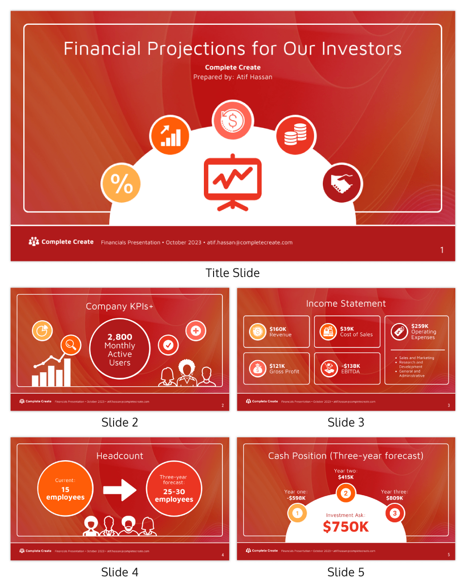
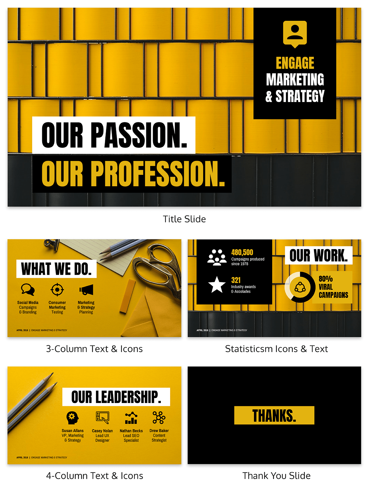
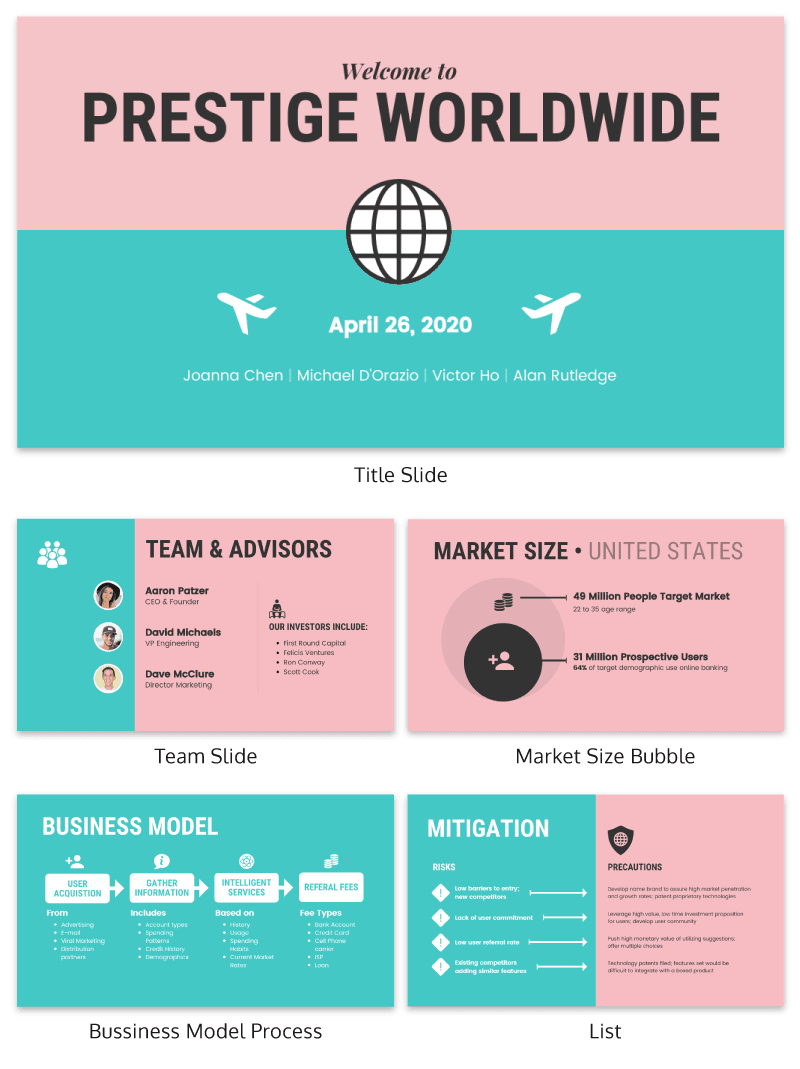
When designing a presentation deck, you can find a ton that will guide you through how to create one that's well-designed and has content that is compelling. But what are the things you need to avoid? Here's a list of the 16 things you need to avoid:
1. Don't use too many fonts on your presentation deck
Using too many fonts can be dizzying for your audience, as it can be difficult to keep track of the different styles throughout the presentation. This can also make your deck look unprofessional and disorganized. Try to stick to two or three fonts at most in your deck.
2. Don't cram too much information on one slide
Too much information on one slide can be overwhelming for your audience and make it difficult for them to follow along. Try to break up your information into smaller, more manageable chunks, and use slides that are easy to read and understand. Limit it to 6-8 bullet points per slide.
3. Don't use text that's too small
You want your audience to be able to read your slides without having to squint or strain their eyes. When designing your presentation, make sure that all of the text is legible from at least the first row of seats in the room. This will ensure that everyone in your audience can read your slides without having to strain their eyes. You may also want to consider using a larger font size for your text.
4. Don't use colors that clash
When using different colors in your slides, make sure that they complement each other and don't clash. This can be visually jarring for your audience and make it difficult to focus on the content of your slides. Additionally, using too many different colors can make your deck look unprofessional and chaotic. Stick to two or three colors at most in your deck.

Venngage
5. Don't use animated gifs or videos
Unless you're absolutely sure that they will add value to your presentation, avoid using animations that will distract from your message. Animated gifs and videos can be fun and engaging, but if they're not used correctly, they can actually be quite distracting for your audience and take away from the point you're trying to make. Try to use animations sparingly, and only if they truly add value to your presentation.
6. Don't use too many graphics or images
Similar to gifs and videos, graphics and images can be engaging for your audience, but if they're not used correctly, they can actually take away from the point you are trying to make. So when designing a presentation deck or slideshows of any kind graphics must enhance what you want them to while also allowing people's attention to focus on content as well without being distracted by anything else. Try to stick to 1-2 graphics or images per slide.
7. Don't use text over graphics or images
When you place text overtop graphics or images, it can be difficult for people to read the text. This is because they are trying to focus on the image or graphic, and they don't have time to focus on the text as well. This can be frustrating for your audience, and it can also make it difficult for them to follow along with your presentation. Try to avoid placing text overtop graphics or images whenever possible.
8. Don't use too much white space
Too much white space can make your slides look sparse and unfinished. Try to fill up as much of the slide as possible without overcrowding it.
9. Don't use cheesy clip art
Not only will this look unprofessional, but it will also be a distraction from your message. When designing a presentation deck or slideshows of any kind, it is important that graphics enhance what you want them to while also allowing people's attention to focus on content as well without being distracted by anything else.
10. Don't use complicated charts or graphs
Complex charts and graphs can be confusing and overwhelming for your audience, and they may not be able to follow along with your presentation. If you're not confident that your audience will be able to understand your charts or graphs, avoid using them in your presentation. Stick to simple ones that are easy to follow.
11. Don't use more than 2 colors in a chart or graph
Again, this can be visually jarring for your audience and make it difficult to focus on the content of your slides. Stick to 2 colors at most for charts and graphs.

Venngage
12. Don't use text that's too small in charts or graphs
Just like with regular text, you want your audience to be able to read the text in your charts and graphs without having to squint or strain their eyes. Make sure all text is legible from at least the first row of seats in the room.
13. Don't use more than 3 types of fonts in a pitch deck
Using too many fonts will again make it difficult for your audience to follow along with your presentation. Stick to 3 types of fonts at most.
14. Don't use a different font for every slide
Sticking to 1 or 2 fonts throughout your presentation will make it look more professional. If you do want to use a different font for certain slides, make sure it still looks cohesive with the rest of your presentation.
15. Don't use too many text boxes on one slide
Too many text boxes can again overwhelm your audience and make it difficult to follow along. Limit yourself to 2-3 text boxes per slide.
16. Don't forget to proofread!
This one should go without saying, but it's important to always proofread your slides before presenting them to ensure that there are no spelling mistakes or grammatical errors.

Venngage
Bottom Line
Designing a presentation deck entails always putting your audience in mind first. It's important to have a great-looking design but if it does not serve your audience well, you defeat the purpose of creating one. Learn to strike a balance so that your presentation is both visually appealing and effective. If you need design help, visit Venngage for a multitude of presentation deck templates you can easily customize to fit your needs. You can also try other Venngage infographics to spruce up your deck even more. Check it out now and design away!

